
A portfolio that varies
One brand may have a single product. Another may need room for several SKUs, supporting copy, and outside links.
Featured Project · Website Strategy And Concept
MF Beverage needed a polished public experience, flexible brand presentation, and a private path to trade resources. The concept makes each part feel simple without ignoring the complexity behind it.
One Brief, Three Real Needs
The trick was deciding how to organize uneven brand assets, give trade partners fast access to the right files, and keep the company personality warm and professional.
One brand may have a single product. Another may need room for several SKUs, supporting copy, and outside links.
Sales materials and product assets should be convenient for approved trade partners without becoming a public file dump.
The experience should feel capable and organized while still reflecting a company built around hospitality and relationships.
Public Experience
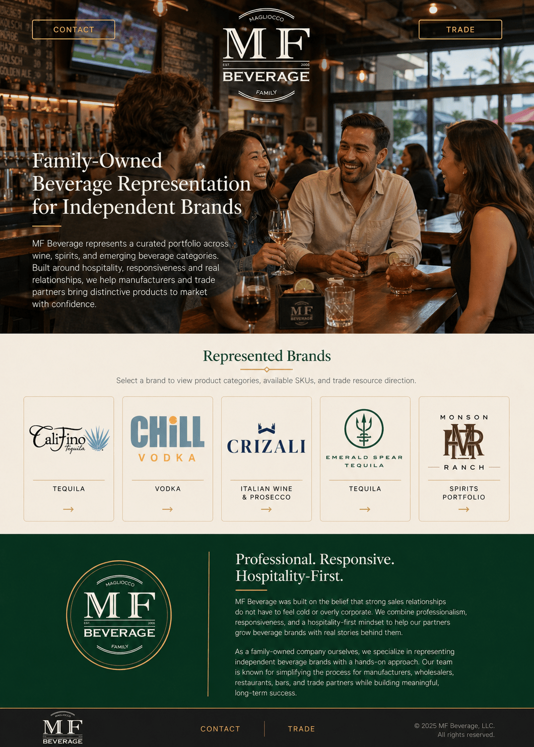
The homepage direction uses a casual hospitality setting, simple navigation, and a clean brand grid that can grow without turning the page into a catalog wall.
Flexible Brand Presentation
Brand tiles keep the homepage clean. Each one opens the amount of detail that particular brand needs, whether that is one featured product or a broader portfolio.
The same interaction handles different content volumes without forcing every brand into an identical page.
A focused brand can use the same polished frame without leaving awkward empty space.
A larger lineup gets more room while preserving the same interaction and visual language.
Cards can point visitors to a brand website or direct approved users toward trade materials.
Gated Trade Resources
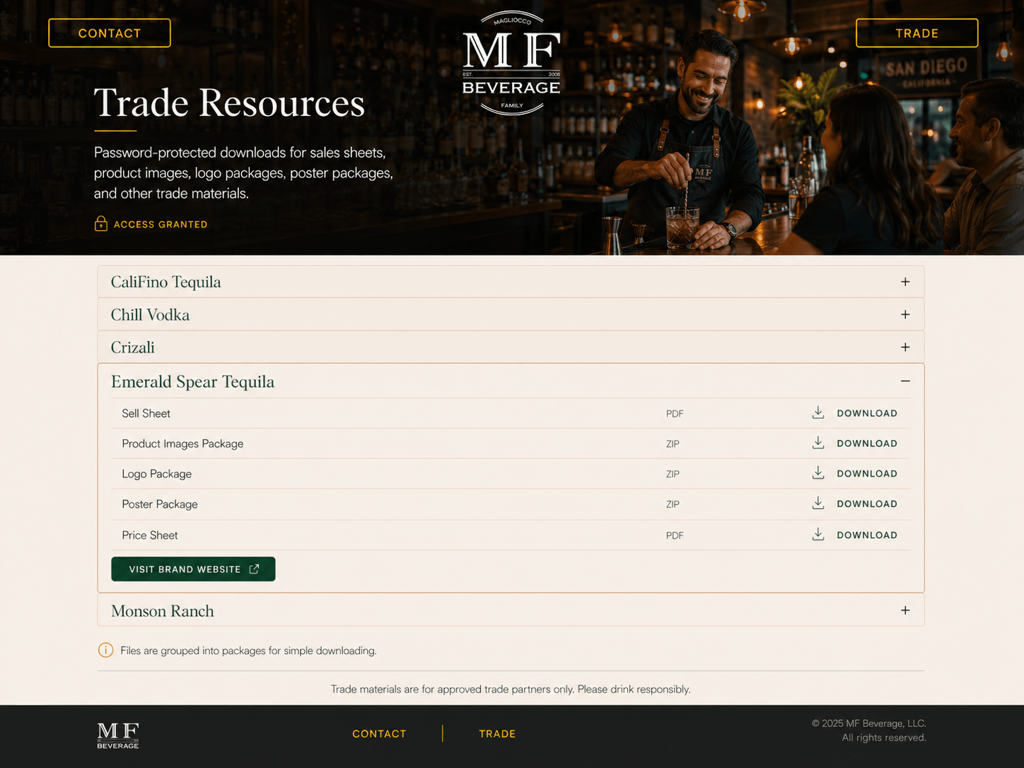
The concept organizes trade materials behind a password, then uses a familiar accordion structure so approved users can find and download the right package without navigating a maze.
Brand Voice At Every Step
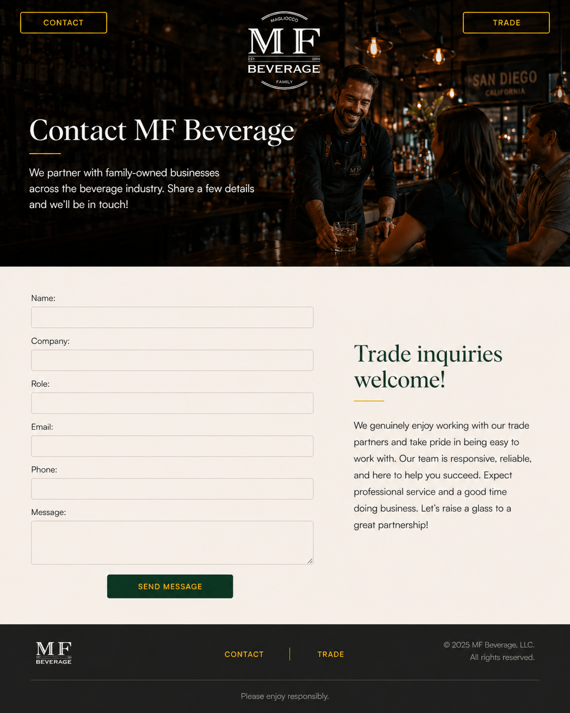
A practical form can still reinforce the personality of the business. Here, the supporting message stays warm, responsive, and hospitality-focused.
“Expect professional service and a good time doing business. Let’s raise a glass to a great partnership!”
Why Choose Top Jump Marketing
A good website concept connects the public story, the content system, the protected resources, and the future needs of the business.
The team can stay with the problem long enough to determine what should be designed, written, built, protected, connected, or simplified.
Make The Complicated Brief Feel Simple
Bring us the content, the process, or the messy set of requirements. We can help turn it into a clear experience.
Tell us what people need to browse, understand, access, or download.